Why should I use R: The Excel R plotting comparison: Part 2

This is part 2 of an ongoing series on why you should use R. Future blogs will be linked here as they are released.
- Part 1: Why should I use R: The Excel R Data Wrangling comparison: Part 1
- Part 2: Why should I use R: The Excel R plotting comparison: Part 2 (This post)
- Part 3: Why should I use R: Handling Dates in R and Excel: Part 3
Why create plots in R and not Excel? To a programmer this may seem like a very obvious question, but it is still a common question asked by Excel users — If you have a data set, could you select it, hit a couple of buttons and generate plots? This is one of the trickiest questions to answer, especially if you have limited Excel experience as many new age data scientists do. Hopefully, some of the reasons below will encourage you to make the switch from Excel to R.
Reproducibility
How do you view the code used to generate the Excel graph? Are you able to tell exactly whats going on? Are you able to control and modify all of the aesthetics of the plot, such as changing the length of the axis ticks, or changing the font? If yes, are you able to share your work with a colleague and have them easily replicate your plot without you telling them where to click and which modification should be applied?
With R all of these things are possible. You automatically have all the code visible in the form of scripts. Reading and understanding the code is possible because of its easy to read syntax, which allows you to track what the code is doing without having to be concerned about any hidden functions or modifications happening in the background.
Understanding changes
In Excel it is challenging to eye-ball which changes have been made to a graph, especially if these were minor changes. With R (and some easy to use version control systems), you can see exactly which files were changed. Also, in Excel, a user would usually draw a graph on a single Excel document, and if the same graph is required on a different data set, it is common to copy-and-paste a bunch of manipulations and configurations to another document. Such repeated human interaction is prone to introducing errors, as well as consuming a large amount of time. With R we can avoid this by creating functions, which can be used to run the same code on different data sets simply by changing the input, thereby producing reliable outputs and saving us a lot of time.
Extensibility
Yes, Excel has a wide range of basic graphics available, but R has a lot more. Excel has been around for a while, so it has some decent tools that have been developed over the years. R, however, is open source, and therefore extensions are widely available - it’s even fairly easy to make your own. R also has thousands of libraries that can be used to easily produce graphics without all the pre-graph work to create some really crafty stuff. With that being said, Excel is perfectly sufficient when creating basic, simple, straight forward plots. But what if we’re not looking to be basic?
The simplicity of R
The package {ggplot2} is a plotting
package in R that provides us with commands to create complex plots. R’s
command line interface let’s you quickly select x- and y-axis labels,
colour by variables, modify grid lines and much more. Each item is added
in a new layer, which allows us to add in and remove graph elements
without affecting the rest of the plot. Interested in changing the
colour gradient/scale of your plot? No problem, just use a package
called
{RcolourBrewer},
which helps you select sensible colour schemes for your plots.
Interested in changing the title of your plot? Simply add a layer called
ggtitle - and so much more.
The comparison
Let’s create some simple plots in Excel and then create a similar plot in R using the {ggplot2} functions. Hopefully, by the end of this post, we’ll have motivated you to switch to R. Now, let’s get started by loading the data and packages. The data set that we’ve used below is data from a selection of movies, and is comprised of five columns: country, year, highest profit gained per movie, number of movies produced and number of employees on set during production.
library("ggplot2") # For plotting
library("viridis") # Provides a range of colour palettes
library("readr") # For loading data
library("tidyverse") # For data wrangling

movies_data <- read_csv("blog_data.csv")
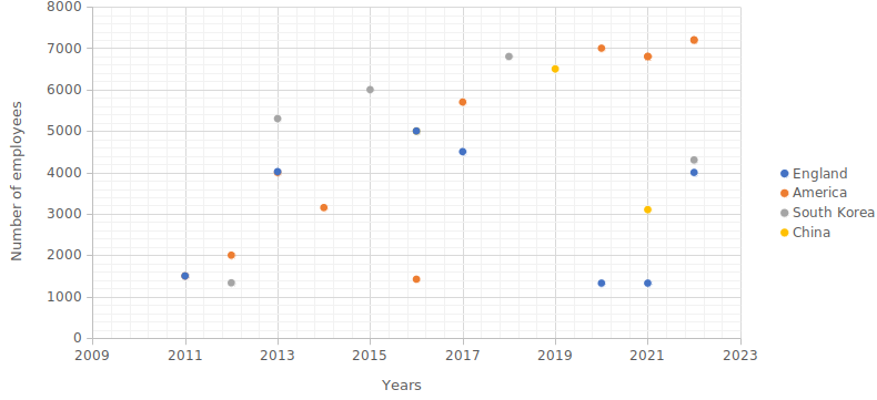
Let’s start by creating a scatter plot, in which we compare the number of employees present in the different countries within each year.
Scatter Plot
Excel
The scatter plot generated in Excel was simple to create, but everything had to be done manually: selecting the data and the variables for the x- and y-axis and then selecting the type of plot. I was also required to manually change the axes titles. If we were interested in changing the grid lines, this would have to be done manually too. Looking at this plot, is this something that you are able to easily recreate? Would you know where to point and click to generate this visualisation?
R
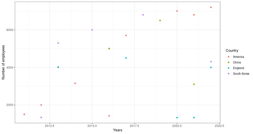
Here we created a similar plot in R using the {ggplot2} functions. Because the code is visible we can easily recreate the plot above, but also, we are able to conveniently see which functions and aesthetics were applied to our plot.
ggplot(data = movies_data, aes(x = Year, y = no_employees)) +
  geom_point(aes(colour = Country)) +
  labs(x = "Years",
       y = "Number of employees",
       colour = "Country") +
  theme_bw()
Theming system in {ggplot2}
Theme arguments specify the non-data features that you can control. For
example, the axis.text argument controls the appearance of the axis
text such as the font size, colour and face of text. The axis.ticks.x
controls the ticks on the x-axis and so on. The theme() function
allows you to override the default theme elements, like
theme(plot.title = element_text(colour = "red")). Complete
themes, like
theme_bw(), set all of the theme elements to values designed to work
together.
We can take this plot even further. Let’s say we were interested in creating the same plot as above, but with each country having its own plotting panel within the same visualisation. We can use the facet function from the {ggplot2} package:
ggplot(data = movies_data, aes(x = Year, y = no_employees)) +
  geom_point() +
  facet_wrap(~Country, ncol = 4) +
  labs(x = "Years",
       y = "Number of employees") +
  theme_bw() +
  theme(axis.text.x = element_text(angle = 45, vjust = 1, hjust = 1))
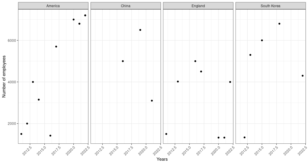
We have also utilised the axis.text.x element to adjust the angle and
position of the x-axis labels to ensure that they are legible. Are you
able to create this in Excel without copying and pasting the graphs? If
so please do show us how you were able to do this.
Now, let’s proceed to create a histogram using Excel and R. Looking at
the theme() function alone, we can see that R has a lot more features
available that we are able to modify, such as axes text, fonts, legend
size and grid lines. As a data enthusiast, which graph looks more
aesthetically pleasing to you?
Histogram Plot
Excel
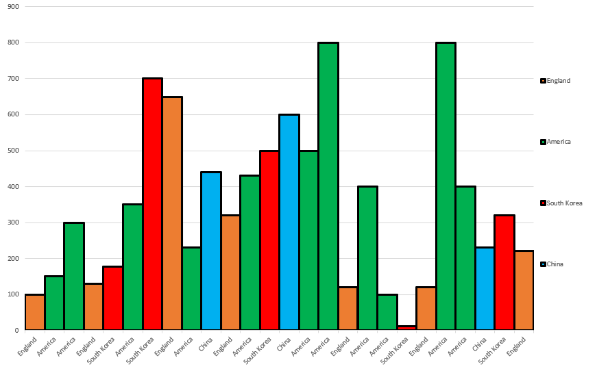
The histogram generated below was a bit more time consuming. Firstly, we had to change the size of the bars in a normal bar graph in order to generate a histogram. The colours of each column had to manually be selected and applied. Adding a legend to this plot was also a manual process. Looking at this plot, is this something that you are able to easily recreate?
Now, let’s generate a histogram using R and its {ggplot2} functions.
R
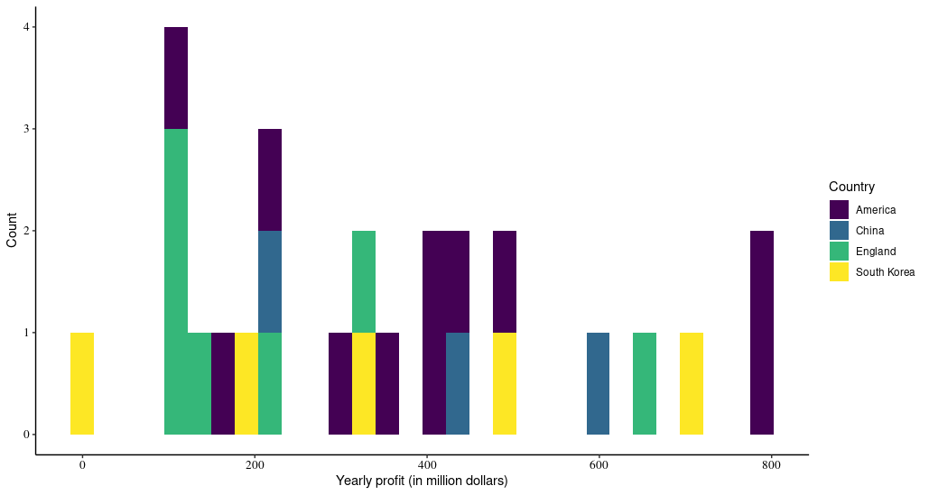
Once again, it is evident that we can easily control all of the
variables and aesthetics of the histogram plot generated using ggplot.
Here we used a new function called the
scale_fill_viridis()
which is a function for {ggplot2} which allowed us to modify the colours
visible on the histogram bars. We also used the theme_classic()
function in R to create a classic looking plot with x- and y-axis lines
and no gridlines. We also edited the size, colour and font of the text
on the axes (axis.text).
ggplot(data = movies_data, aes(x = Highest_profit)) +
  geom_histogram(aes(fill = Country)) +
  labs(x = "Yearly profit (in million dollars)", y = "Count") +
  scale_fill_viridis(discrete = T) +
  theme_classic()+
  labs(colour = "Country") +
  theme(
    axis.text = element_text(size = 10, colour = "black", family = "serif")
  )
Now, let’s move on and generate our last plot.
Line Plot
Excel
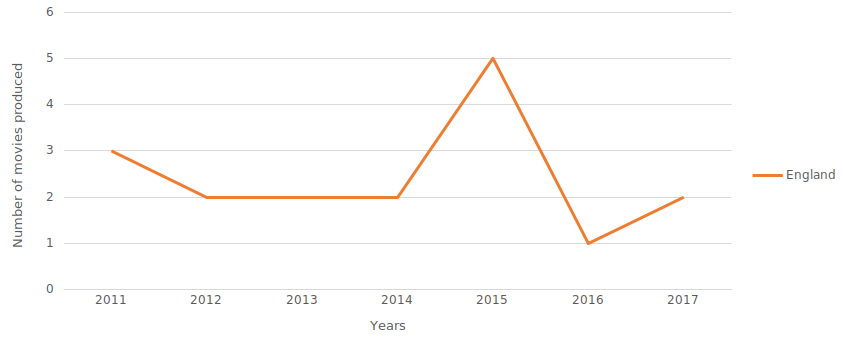
The line plot was the most complex plot to create. Firstly, when generating the line graph, it was evident that the data within the year column had to be rearranged in ascending order or it will put the earlier years after the later years. The line graph was also not able to plot more than one graph representing each country as a different line as some countries did not have data for all the years. After a lot of frustration with Excel we attempted to create a very basic line plot in R.
R
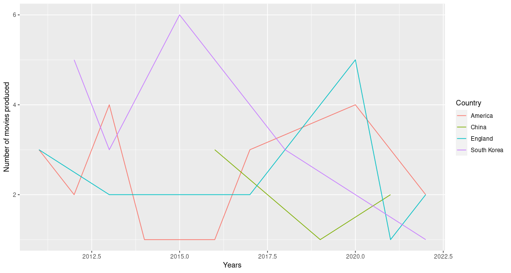
With only three lines of code and very little frustration, we were easily able to recreate the line graph above in R.
ggplot(data = movies_data, aes(x = Year, y = Number_movies)) +
  geom_line(aes(colour = Country)) +
  labs(x = "Years", y = "Number of movies produced")
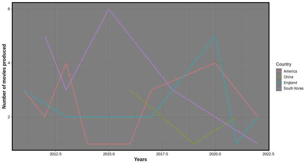
Now, let’s add some more aesthetics to our plot as we did for the
previous ones by changing the font size (axis.title and axis.text),
changing the panel border (panel.border), as well as editing the
legend size (legend.key.size). Here we decided to use the
theme_dark() function in R to create a dark background, which is
commonly used to make thin coloured lines pop out.
ggplot(data = movies_data, aes(x = Year, y = Number_movies)) +
  geom_line(aes(colour = Country)) +
  labs(x = "Years", y = "Number of movies produced") +
  labs(colour = "Country") +
  theme_dark() +
  theme(
    panel.border = element_rect(colour = "black", fill = NA, size = 2),
    axis.title = element_text(size = 12, face = "bold", family = "Arial"),
    axis.text = element_text(size = 10, colour = "black", family = "Arial"),
    legend.key.size = unit(0.50, "cm")
    )
When comparing R and Excel, it’s important to define the level of information you are looking for. If you want to run basic statistics quickly, Excel might be the better choice. If you are interested in creating a very basic graph, Excel may be the better choice, due to its easy point-and-click system. Before plotting a graph ask yourself; “How detailed does my visualisation need to be? Am I creating a plot for a publication or not? In Excel it is evident that we can easily select a chunk of data and make a simple chart, however, when making more comprehensive plots, using Excel can be extremely frustrating and time consuming. It all comes down to what you need your graphics to do. For those planning to publish large amounts of complicated data, spending the time in R to create impressive visual representations will certainly be worth your time. It is also clear that R is not difficult, and gives you the option to customise more than Excel.
R and Excel are beneficial in different ways. Excel starts off easier to learn and is the go-to program when we are exposed to computers and some of us end up being stuck there. However, R is designed to be reproducible which is clearly of high importance. It’s not a question of choosing between R and Excel, but deciding which program to use for different needs.
If you’re interested in learning how to create graphs using R, then attend our Data visualisation with ggplot2 course.

