Shiny for Python: Creating a simple Twitter analytics dashboard

Introduction
As someone who has zero experience using Shiny in R, the recent announcement that the framework had been made available to Python users inspired an opportunity for me to learn a new concept from a different perspective to most of my colleagues. I have been tasked with writing a Python related blog post, and having spent the past few weeks carrying out an analysis of Jumping Rivers’ Twitter data (@jumping_uk), creating a dashboard to display some of my findings and then writing about it seemed like a nice way to cap off my 6-week summer placement at Jumping Rivers.
This post will take you through some of the source code for the dashboard I created, whilst I provide a bit of context for the Twitter project itself. For a more bare-bones tutorial on using Shiny for Python, you can check out another recent Jumping Rivers blog post here. I suggest reading this first.
Twitter Project Background
The @jumping_uk Twitter project accounted for the first half of my time at Jumping Rivers. The aim of the project was to look into some of the factors that may (or may not) have been affecting levels of engagement with @jumping_uk tweets. The project also looked at the locations of Twitter users that @jumping_uk tweets are reaching and who is interacting with them. The data used in this project was acquired using {rtweet}, an R package designed to collect data via Twitter’s API.
Creating a Dashboard
You may know that Shiny apps consist of a user interface (UI) and a server function. We will go through developing these one at a time. If you haven’t already, you will need to install {shiny} and other dependencies before we begin, in this instance {plotnine} for plotting and {pandas} for some data manipulation. This should be done in a virtual environment which helps to keep dependencies required by different projects separate. The {Jinja2} dependency is required for some styling that will be applied to the tabular view of our dataframe.
# shell
virtualenv .venv
source .venv/bin/activate
pip install shiny pandas plotnine Jinja2
User Interface
This application will be created using a single source file (app.py) that creates both the user interface and server-side logic. First, we will create the user interface. The UI takes a range of input and output functions, and defines what users will see when they visit the dashboard. The {shiny} package provides a ui module which has a host of functions for quickly creating your layout, inputs and outputs.
# app.py
from shiny import ui
Layout
A ui.page_* function is a top level container for our UI elements. ui.page_fluid() gives us a full-width container spanning the entire width of the viewport, regardless of screen size.
A ui.layout_sidebar() provides a convenient mechanism for laying out content into two columns, a narrower container typically used for user input controls and a wider one for the main content. This is done by including ui.panel_sidebar() and ui.panel_main() within our layout function.
This is what we have so far, laying out the core structure of our page
# app.py
app_ui = ui.page_fluid(
    ui.layout_sidebar(
        ui.panel_sidebar(),
        ui.panel_main()
    )
)
Inputs and Outputs
Now, we are going to put some input and output functions into our UI. These follow a predictable format and are easy to remember:
ui.input_*for inputs, which take values from the user, client-side, and send them to the server.ui.output_*for outputs, which will receive data from the server and render it on the client.
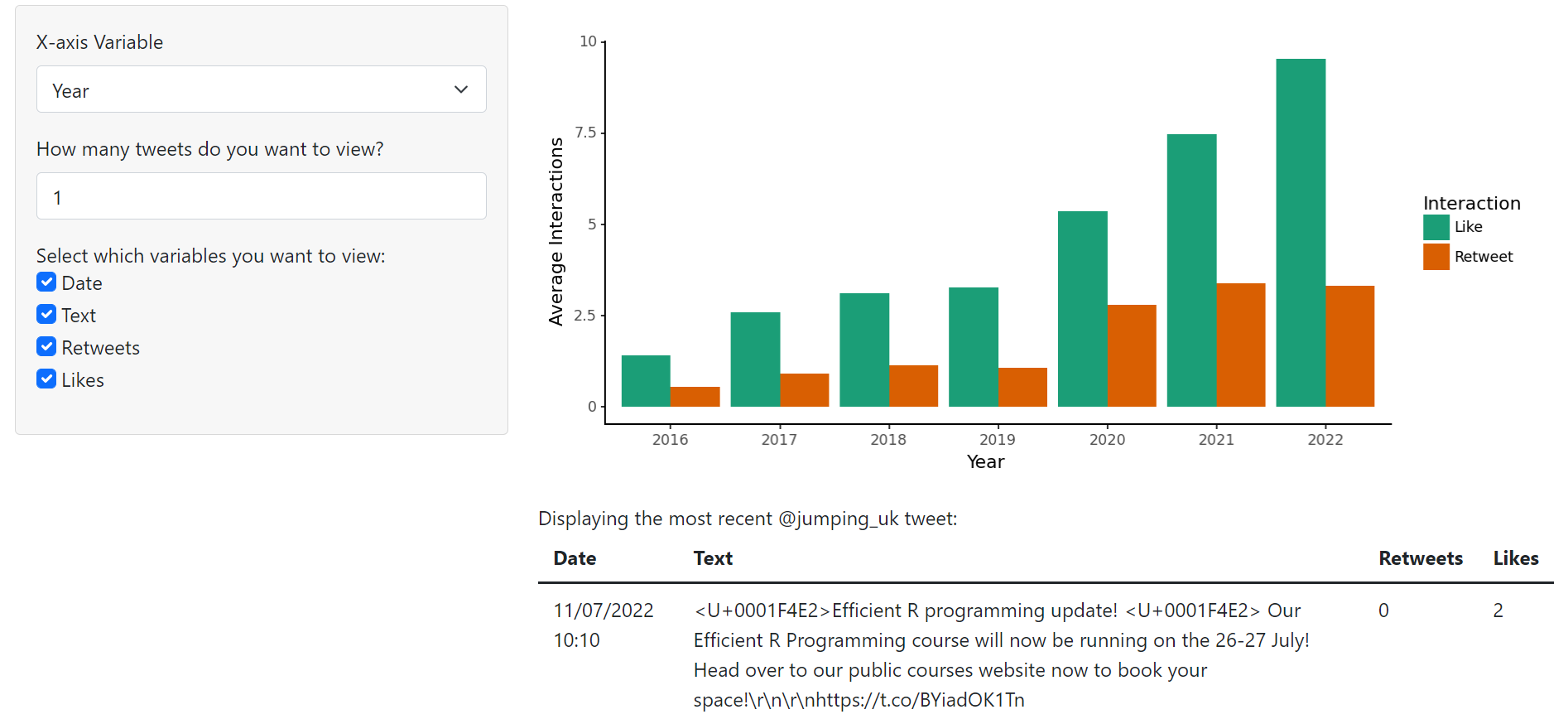
For our Twitter dashboard, we want a plot (ui.output_plot()) that will show how different factors affect the number of interactions a tweet receives. We will also have a table (ui.output_table()) that shows the most recent tweets posted by @jumping_uk. Above the table, some descriptive text (ui.output_text()) saying how many tweets are being viewed. The only argument required for an output function is the id, which must be unique, used by the server function to identify the approriate container in which to render the content.
We want the user to be able to change the x-axis variable on the plot so they can see how each factor affects interactions. For this, ui.input_select() is a reasonable choice to give users the option of a constrained set of values. The number of entries in our table will be chosen by the user (ui.input_numeric()) as well as the factors they want to see (ui.input_checkbox_group() is a good choice for a collection of binary choices like this). This checkbox input we will wrap in a ui.panel_conditional(), so that it only appears if a certain condition is satisfied (in our case if the user chooses to view any tweets at all). All input functions require:
id: unique identifier for the element, used to refer to its value server-sidelabel: what the input will be labelled as to the viewer.
Many input functions will have additional arguments, such as min and max values for numeric inputs, or choices and selected for inputs where the user needs to make a selection that controls the specifics of that input.
A full user interface is described below
# app.py
from shiny import ui

# dictionary of choices for input_select
# x axis of our graph of form {"value": "UI label"}
choices_select = {
    "year": "Year",
    "day": "Day",
    "hour": "Hour",
    "media_type": "Media"
}

# dictionary of choices for checkbox group
# factors for table of form {"value": "UI label"}
choices_check = {
    "created_at": "Date",
    "text": "Text",
    "retweet_count": "Retweets",
    "favorite_count": "Likes"
}

app_ui = ui.page_fluid(
    ui.layout_sidebar(
        ui.panel_sidebar(
            # user inputs in the sidebar
            ui.input_select(
                id="x", label="X-axis Variable", choices=choices_select, selected="year"
            ),
            ui.input_numeric(
                id="num",
                label="How many tweets do you want to view?",
                value=0,
                min=0,
                max=50
            ),
            ui.panel_conditional(
                # a client-side condition for whether to display this panel
                "input.num > 0 && input.num <= 50",
                ui.input_checkbox_group(
                    id="cols",
                    label="Select which variables you want to view:",
                    choices=choices_check,
                    selected=(["created_at", "text"]),
                )
            )
        ),
        ui.panel_main(
            ui.output_plot("plot"), ui.output_text("text"), ui.output_table("table")
        )
    )
)
Server Function
from shiny import render
Our server function will take three arguments: input, output, and session, each of which will be passed to our function when we run the application. The input parameter gives access to the values bound to the input_X UI functions by their id, output gives us somewhere to direct our content to be rendered and session contains some data specific to the browser session that is connected to the application.
When defining outputs within our server function, we want to define a function that matches the id of its corresponding output function in the UI. We preceed this function with decorators @output and @render.*. The render decorator should match the output function it’s referring to. For a plot we will use @render.plot, for a table @render.table etc. If we want to call an input in our server function, we use input.*. For example, if we have an input with id = abc, we would call it with input.abc().
A full server function with imports might then look like
# app.py

import pandas as pd
import plotnine as gg

# read data from file
jr = pd.read_csv("jr_shiny.csv")
jr = jr.astype({"day": "object"})

def server(input, output, session):
    @output
    @render.plot
    def plot(): # function name matches the id="plot" in the outputs
        # access input id="x" value with input.x()
        avg_int = jr.groupby(input.x(), as_index=False).agg(
            {"retweet_count": "mean", "favorite_count": "mean"}
        )
        avg_int = pd.melt(avg_int, id_vars=input.x())
        plot = (
            gg.ggplot(avg_int, gg.aes(input.x(), "value", fill="variable"))
            + gg.geom_col(position="dodge")
            + gg.ylab("Average Interactions")
            + gg.scale_fill_brewer(
                type="qual",
                palette="Dark2",
                name="Interaction",
                labels=(["Like", "Retweet"]),
            )
            + gg.theme_classic()
        )
        if input.x() == "day":
            return plot + gg.scale_x_discrete(
                labels=(["Mon", "Tue", "Wed", "Thu", "Fri", "Sat", "Sun"])
            )
        else:
            return plot

    @output
    @render.text
    def text():
        if input.cols() == () or input.num() <= 0 or input.num() > 50:
            return ""
        elif input.num() == 1:
            return "Displaying the most recent @jumping_uk tweet:"
        else:
            return f"Displaying the {input.num()} most recent @jumping_uk tweets:"

    @output
    @render.table
    def table():
        cols = jr.filter(input.cols())
        cols.rename(
            columns={
                "created_at": "Date",
                "text": "Text",
                "retweet_count": "Retweets",
                "favorite_count": "Likes",
            },
            inplace=True,
        )
        pd.set_option("colheader_justify", "left")
        first_n = cols.head(input.num())
        if input.num() <= 0 or input.num() > 50:
            return None
        else:
            return first_n
Finishing Touches
The App class allows us to define an object that contains both the UI content and the server function together.
# app.py
from shiny import App
app = App(app_ui, server)
We can then run our app, the command line interface will look for an object called “app” to act as
the entrypoint by default, however this can be specified to be something else, see shiny run --help
shiny run --reload app
The run command will preview our app, and --reload will reload the app whenever we make changes to our code.

Reflections
The arrival of Shiny to Python will open up the framework to a whole new cohort of users, myself included! Whilst I have found grasping the basic concepts to be relatively straightforward, I have found learning resources to be pretty much limited to the API. Advancing past the core concepts may be more challenging, particularly (I imagine) for users with no experience in Shiny for R, due to the lack of online reading material. We can also expect changes to be made in the coming months, with Shiny for Python currently being in Alpha. However, with Shiny being such a popular framework amongst R users, the expansion of it to Python is very exciting, and I look forward to seeing how it develops in the future.
View the dashboard I created:

