Effect of Shiny Widgets with Google Lighthouse

- Part 1: Using Google Lighthouse for Web Pages
- Part 2: Analysing Shiny App start-up Times with Google Lighthouse
- Part 3: Effect of Shiny Widgets with Google Lighthouse (This post)
This is the third blog in our series on the Google Lighthouse tool. In Part 1, we looked at what Lighthouse is and how it can be used to assess the start-up times of webpages, and in Part 2, we used Lighthouse to test Shiny apps and performed some analysis on the 2021 Shiny App Contest submissions. In this final part I am going to create a few Shiny Apps with different content and use Lighthouse to see the differences. I have creatively named my apps app1, app2, …, app6.
The Apps
The default app (app1) I’m using as baseline is shiny::runExample("01_helLo"), it is just a simple app with a slider input and a histogram, where the slider input dictates the number of histogram bins. It looks like this:

To actually see what factors cause changes in load time, I’m going to be building upon this app incrementally. So, app2 is identical to the first, apart from we have a {plotly} histogram instead of a base hist() plot.
For app3 I am adding a simple data table using shiny::renderTable() on top of the second app. App 3 looks like this:

Then app4 is the same as the third only we are replacing the data table with a {DT} data table using DT::renderDT() and DT::DTOutput().
For app5 I have added a date input widget in the sidebar. In the 6th and final app, I have changed the {plotly} histogram to a reactive object (so it’s not computed twice) and rendered it twice, the original place and in the sidebar to see if that has any impact on the scores. The final app looks like this:

So now I have a series of 6 apps of increasing complexity. I can now test to see what impact each component I have added does to the Lighthouse reports. I will test each app 10 times to give more accuracy in the results and so we can see variance in the Lighthouse reports. The main things I’m looking at from the report the following Lighthouse metrics (covered in part 1 of the series):
- FCP (First Contentful Paint - ms)
- SI (Speed Index - ms)
- LCP (Largest Contentful Paint - ms)
- TTI (Time to Interactive - ms)
- TBT (Total Blocking Time - ms)
- CLS (Cumulative Layout Shift)
- Score
Histogram showing all metrics measured in the Lighthouse report
To get a feel for the data obtained, here is a histogram for each of the metrics reported by Lighthouse across the different apps:

With this we can see the spread of score in each metric. This plot gave me a good idea of how to further explore the data.
Time to Interactive vs Speed Index

In this scatter plot of TTI (Time to Interactive - ms) vs SI (Speed Index - ms), we can see the times increasing with each iteration of the app. There is a two-fold difference in TTI between the simplest and the most-complex apps. We can see groupings in the data like {app1}, {app2, app3} and {app4, app5, app6}. This suggests that the first {plotly} graph and the {DT} data table are the most influential components.
Boxplot of App vs Speed Index

This box plot of App vs speed index shows that as the we iterate on the app it’s not just the loading times that increase but the variability in loading times as well.
Score vs First Contentful Paint

Here the more complex apps have slight decreases in overall Lighthouse score as the time for first contentful paint increases. Those complex apps also show a wide variability in the overall score. Some runs for an app gained a “Good” user experience rating (90+) and others a “Poor” experience (50-89). The first contentful paint scores were relatively constant for a given app, so I investigated why the difference on 10 score points arose for those apps.
Different Lighthouse Scores From the Same App
I mentioned in the last blog that you can getting different Lighthouse scores across runs and suggested doing a few reports to get the best results (I included some information on why this might be in part 2). I now have some evidence of it happening and I want to see why we have the exact same app going from high 80’s to high 90’s Lighthouse score. Of the 60 app tests I did 9 of them had sub 90 scores, all of them coming in apps 4 and 5.
Radar plot

This radar plot compares the mean scores for the apps with Lighthouse scores over 90 vs the ones without. 0% represents the lowest score I recorded for a metric and 100% represents the highest. We can see the sub 90 apps have performed noticeably worse (higher times in each metric, bar score where higher is better), particularly cumulative layout shift. This metric measures movements in the layout of a page, a good example is clicking a button before a page has fully loaded and then the page moves and you have clicked the wrong thing, a better explanation is here.
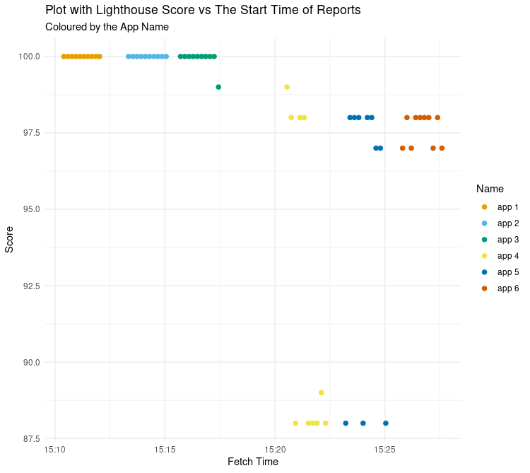
Score vs Fetch Time


It seemed odd that there was such a big difference between different runs of the same apps, and also that the most complex app (app6) wasn’t affected in the same way. What else could explain why app4 and app5 had these poor runs?
Perhaps the best explanation for this is a drop in my network speed during the runs…
If we look at the overall scores for the Lighthouse runs against the time when the run was started, there is a clump of sub 90 scores between 15:21 and 15:25. This plot looks very similar to the score vs speed index earlier. I do not have data about my network speed at the time of running the apps, but it looks like there was a dip in network speed at this time. This is backed up by the fact the sixth app has no sub 90 score despite being the most complex.
So even when your app works well, factors beyond your control may affect your Lighthouse results.
Final Words
At our Shiny in Production conference in October our final keynote speaker, the data visualisation expert Cara Thompson, was asked about her thoughts on interactive visualisations in Shiny apps and in the ensuing discussion Andre de Vries from Posit mentioned that {plotly} plots add about a second of loading time each to an app.
Overall the results are pretty straight forward; adding more widgets to your Shiny app is going to slow it down. We can clearly see that adding interactive elements such as {plotly} plots and {DT} tables to your apps will slow them down. I’m not going to recommend not using them, because they don’t add that much time if you use them sensibly. One of the main points of Shiny is interactivity after all - you may as well have a markdown report otherwise.
That being said, don’t have a hundred plotlys in your app, because it will be slow. By all means, put a {plotly} in because it “looks cool” but just remember you are sacrificing a little bit of performance. At the same time maybe think twice about putting a widget when something static would be better for the user.
Retrospectively I wish I had made a few more apps with more interactive content and tried some interactive maps, as I imagine that maps would have a big impact on load times. Why not just add more apps to this analysis and generate more reports? The 60 Lighthouse reports that were covered here were run consecutively on the same day. Including additional Lighthouse reports after those initial reports may introduce extra complications to the analysis, due to internet speed variability, updates to Lighthouse etc.
All being said, Lighthouse is just one tool for assessing the user-experience of your app, and it won’t tell you if your app is “good” or not. Having a fast and efficient app is important for usability, but how enjoyable and easy it is to use are more important for users. This type of feedback is only going to be obtained via user testing and asking users what they are gaining from your app.

