Top 5 Shiny UI Add-On Packages

There are a growing number of Shiny users across the world, and with many users comes an increasing number of open-source “add-on” packages that extend the functionality of Shiny, both in terms of the front end and the back end of an app.
This blog will highlight 5 UI add-on packages that can massively improve your user experience and also just add a bit of flair to your app. Each package will have an associated example app (some more inspired than others) that I’ve created where you can actually see the UI component in action. All code for example apps can be found on our GitHub.
{shinycssloaders}
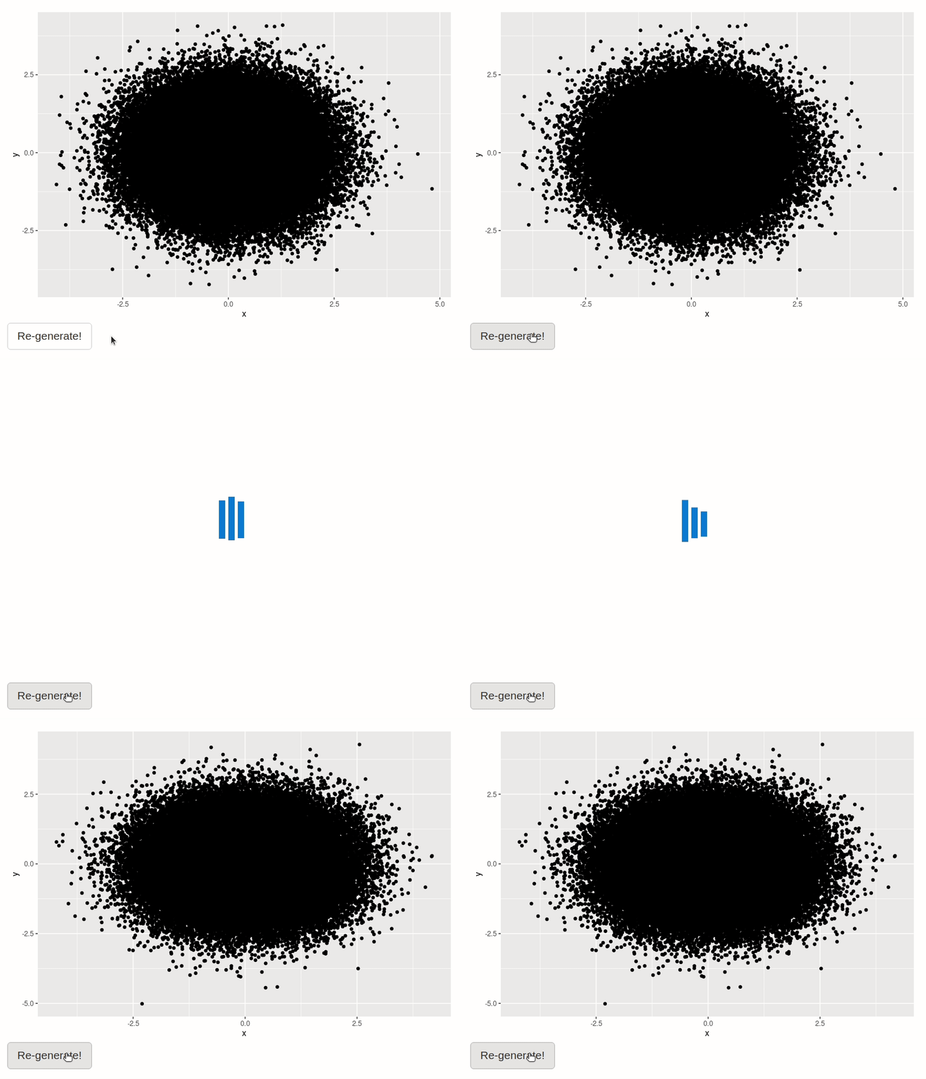
If you have graphs or other outputs in your app that are slow to render and re-render, it can be frustrating for the user if it looks like nothing is changing after they’ve changed an input or pressed a button to re-render. Adding a spinner to indicate the plot is re-rendering makes it clear to the user what is going on and can make that waiting time a bit more bearable!
While the {shinycssloaders} package does not speed up your plot rendering (although if you do need help with speeding up a Shiny app, we can help), it does let you very easily add loading spinners to any specific output in your Shiny app.
All you need to do is wrap your Shiny output in the withSpinner()
function! You can also modify the spinner with the type, color, and
size arguments.
# in the UI
withSpinner(plotOutput("my_plot"))
In my example app:
{waiter}
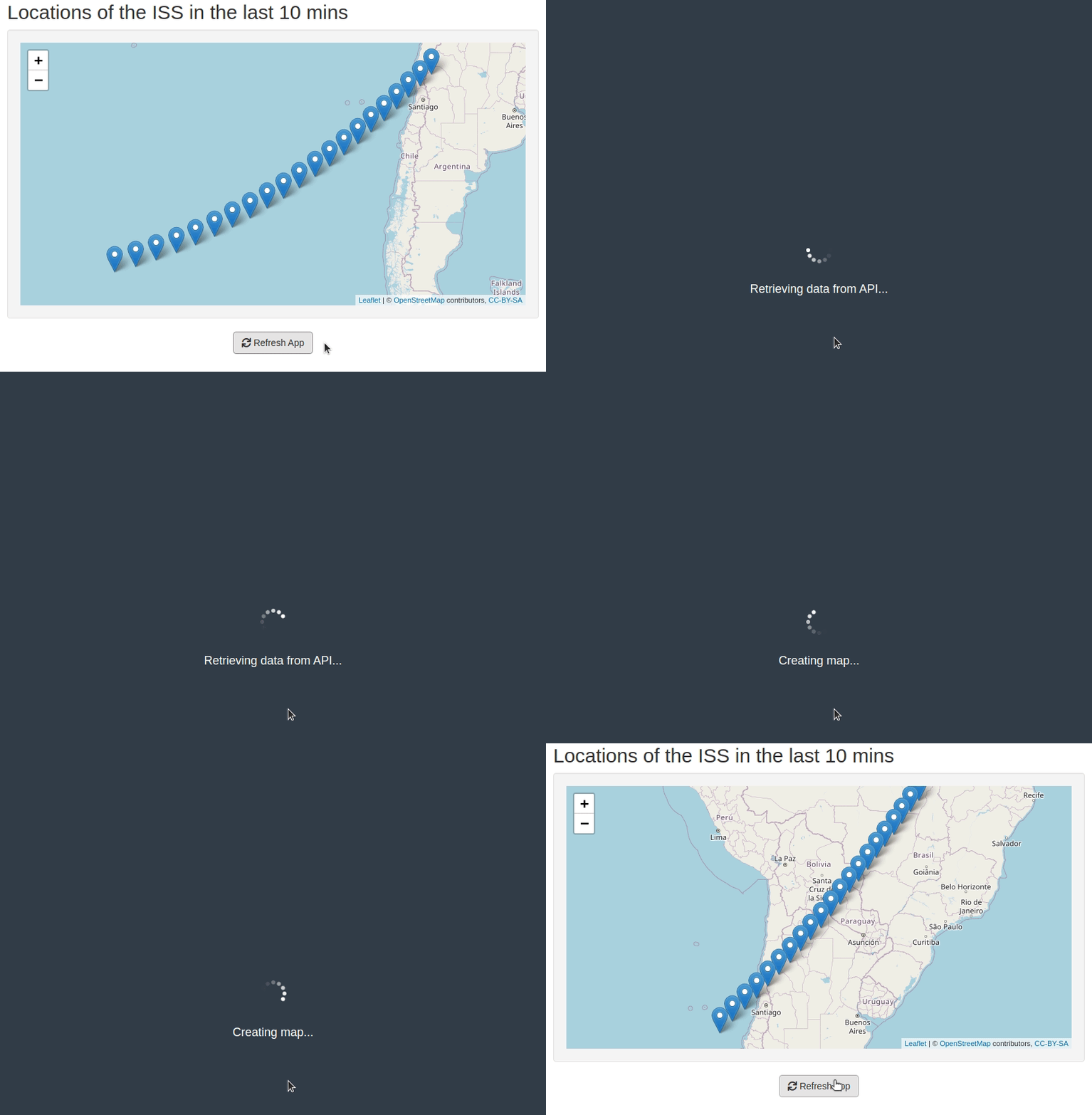
{shinycssloaders} is very useful if you have one or more slow outputs that need to be rendered or re-rendered, but what if just loading up your app at start up is slow? For example, if you’re pulling new data from an API or a database every time you load the app. This is where the {waiter} package comes in handy!
{waiter} allows you to create a loading screen that covers the entire
app until some specific bit of code has finished running. You just need
to tell it when to show (waiter_show()) and when to hide
(waiter_hide()) the waiter loading screen. Note that you’ll need to
activate the waiter functionality by including the useWaiter() command
in your UI.
The basic syntax is:
# in the UI
useWaiter()

# in the server
waiter_show()

  # code that takes a while to run

waiter_hide()
In my example app:
{rclipboard} & {tippy}
If your app needs to generate any kind of text that would then need to
be used elsewhere, e.g. a URL or a uniquely identifying string, then a
“Copy to clipboard” button can easily be added with the {rclipboard}
package. The main function from {rclipboard} is rclipButton() which
creates a clickable button that lets you copy whatever is passed to the
clipText argument. There are no associated render*() or *Output()
functions, so you can create your clipboard button and then render it
with renderUI() and display it with uiOutput(). You will also need
to activate the copy to clipboard functionality by including the
rclipboardSetup() command in your UI.
A basic button could be created like this:
# in the UI
rclipboardSetup(),
uiOutput("clip_button")

# in the server
renderUI({
  rclipButton(
    "clip_button",
    "Copy to clipboard",
    clipText = "Text to be copied",
    icon = icon("clipboard")
  )
})
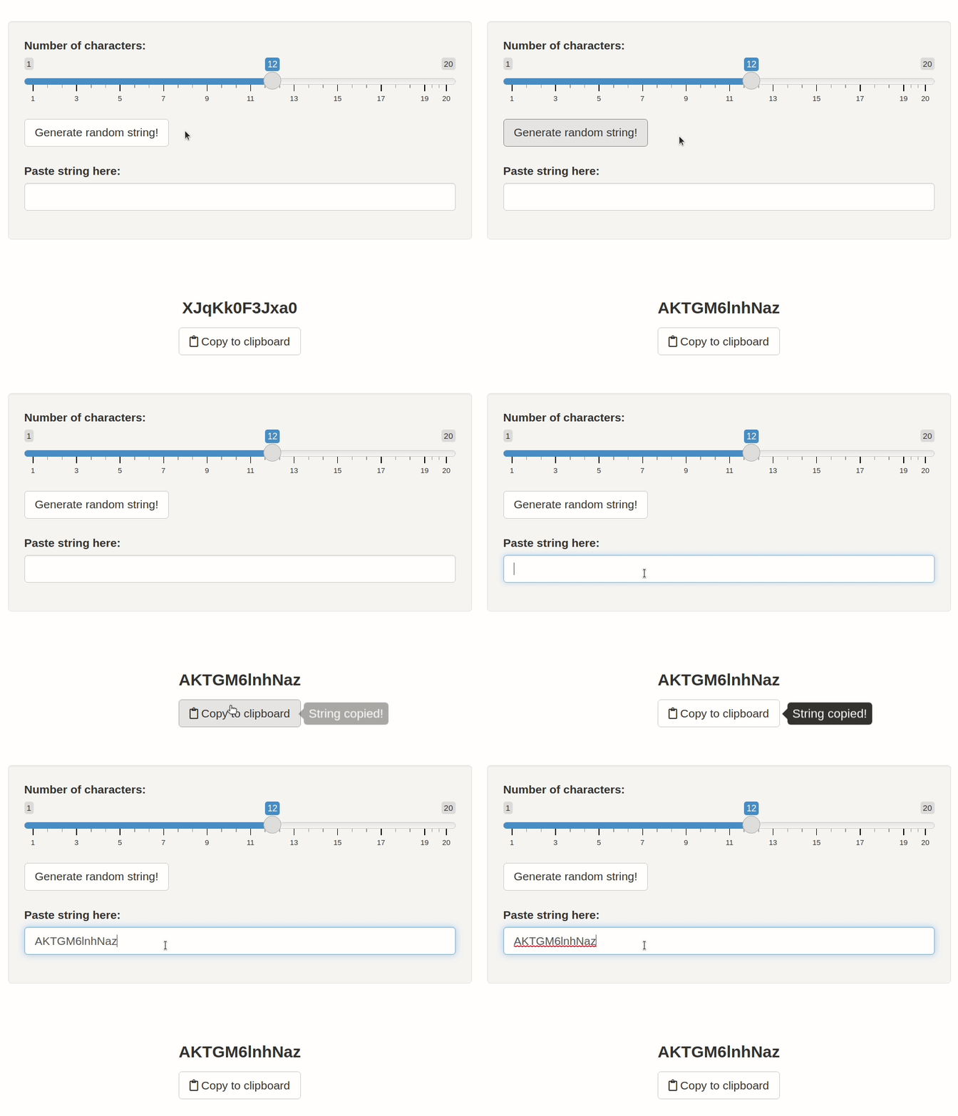
However, when you press this button there is no feedback to the user that anything has actually been copied. This is where the {tippy} package comes in. {tippy} allows you to add tooltips to UI elements in your app that appear at a certain trigger such as hover or click. Tooltips are an effective way to provide help or feedback to the user and improve their experience using the app.
All you need to do is call the tippy_this() function on the input ID
of your UI component. If we have a clipboard button with ID
clip_button as above, we could add a tooltip that says “String
copied!” whenever the button is clicked.
# in the UI
tippy_this(
  "clip_button",
  tooltip = "String copied!",
  trigger = "click"
)
In my example app:
{shinyglide}
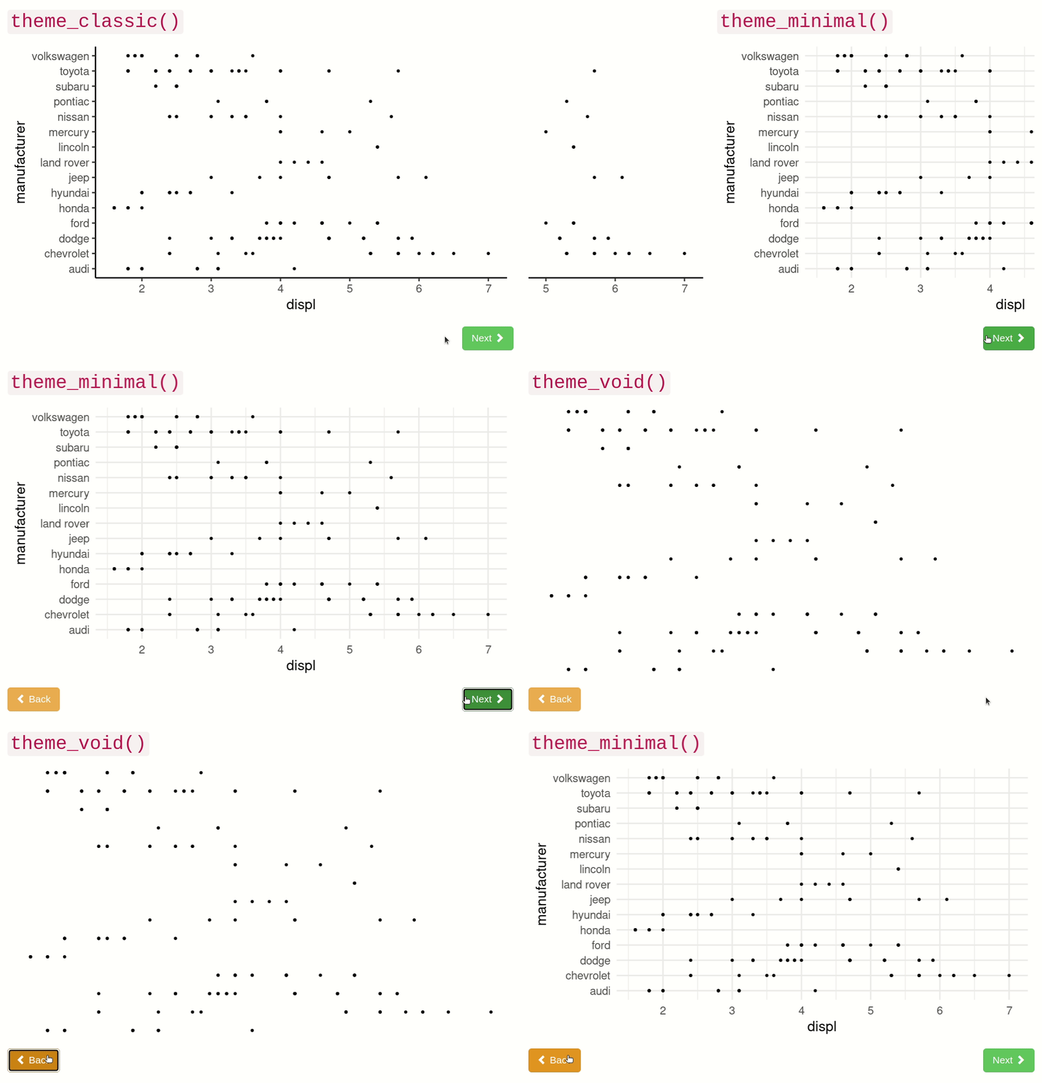
{shinyglide} lets you create a carousel-like window that allows the user to move between different screens in a chronological order using “Next” and “Back” buttons. It’s a nice way to add a pop-up to guide your user through some action, either for collecting inputs for your app, or demoing how to use the app, or just as an embedded presentation.
There is a lot of flexibility when using {shinyglide}, but a basic series of screens could be constructed like this:
# in the UI
glide(
  screen(
    # content on the first screen
  ),
  screen(
    # content on second screen
  )
)
A nice feature is that you can easily add a condition that needs to be
met until the user can move on to the next page, e.g., the user needs to
provide some input. This is done with the next_condition argument in
the screen() function.
In my example app:
{sortable}
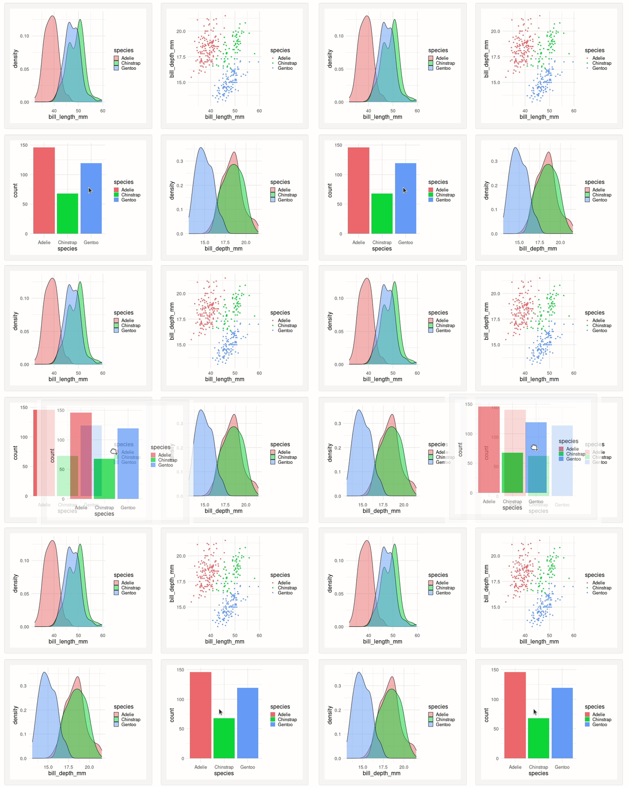
Last but not least is {sortable}, which is a package that enables drag-and-drop behaviour in your Shiny apps. This means that the user can perform actions such as rearranging plots in a grid, or include/exclude elements by dragging them in and out of a specific panel.
The basic syntax of {sortable} is:
sortable_js("element_id")
where "element_id" is the ID of the div containing the elements you
wish to be drag-and-drop-able.
In my example app:
Further resources
If you want to explore even more packages that extend the Shiny framework, I would highly recommend checking out this curated list of Shiny extension packages:

