Making a web application to display data with H2O Wave
If you’re used to coding in Python or R and want to write a web application quickly you can avoid having to learn HTML, JavaScript, etc, by using H2O Wave to write your web application with Python or R. In this post we will go through an example of how to build a simple app to display data in various forms including plots, tables and graphics using Python.
Before continuing with this tutorial if you have no experience with H2O Wave I would strongly suggest going through their introductory tutorials and installation guide first before you proceed. The introductory tutorials will talk you through how to set up basic apps, starting with the classic ‘Hello World’ example that we all know and love and also show you how to install H2O Wave.
To start, I would suggest creating a Python script called app.py, this is where we will write all of our code. To see how the app develops throughout this tutorial, from the terminal we can run:
wave run app.py
If this does not work, make sure you have h2o_wave installed in the python environment that you are using.
The dataset
For this tutorial we will be using an imaginary housing dataset which you can download from Kaggle. It gives a variety of information on housing stock (e.g. number of rooms, square footage, etc…) and their pricing. We will make a simple app to display some of these data.
The basic setup
Whenever I start writing a Wave app I always start with the basic setup which we will use for our web application.
from h2o_wave import Q, ui, app, main

@app('/displayData')

async def server(q: Q):

    apply_layout(q)
    show_homepage(q)

    await q.page.save()

def show_homepage(q: Q):
    pass

def apply_layout(q: Q):
    pass
The first thing we do is import h2o_wave and define where to listen to the user interface with @app() (in our code that will be localhost:10101/displayData). If we now save app.py and visit localhost:10101/displayData in a browser we should see a blank web page. If you keep this browser open, every time we save app.py the browser will update to show the latest additions to our web application.
We then define a function server() which will be run every time a user interfaces with localhost:10101/displayData. Inside server I always call two functions:
apply_layout()where we define the layout of the app.show_homepage()which will be the default loading page for the app.
We’ll start by creating a basic homepage layout that will only include a header and a footer for now, but we will add to this function as we go. We will then add pages to show_homepage() to display the header and footer.
def apply_layout(q:Q):
    q.page['meta'] = ui.meta_card(
        box='',
        theme='nord',
        layouts=[
            ui.layout(
                breakpoint='xl',
                width='1600px',
                zones=[
                    ui.zone('header'),
                    ui.zone('footer')
                ]
            )
        ]
    )

def show_homepage(q: Q):
    q.page['header'] = ui.header_card(
        box = ui.box('header',
        width='100%',
        height='86px'),
        icon='Money',
        icon_color='Black',
        title='Paris Housing Market',
        subtitle='This is an imaginary housing dataset')

    q.page['footer'] = ui.footer_card(
        box='footer',
        caption='This dataset was obtained from [Kaggle](https://www.kaggle.com/datasets/mssmartypants/paris-housing-price-prediction)')
In apply_layout() we add a page, meta, to create a meta_card object. We specify a theme for our app using the theme argument and also define a web app layout using the layout argument. The most important part of apply_layout() is contained within ui.layout for our layout argument. This is where we specify different zones by using ui.zone(). We define a header zone for the header and a footer zone for the footer. Note that a zone can be made up of multiple zones which we’ll see later on.
In show_homepage() we add two cards:
header. This uses theui.header_cardto define the header for our app. Theiconargument references UI Fabric icons.footer. This uses theui.footer_cardto define the footer for our app. Thecaptionargument takes string input but recognises markdown, so you can easily add links like we have here.
Both cards have the argument box. We use box here to link the cards with our layout in apply_layout(). For example, we have a footer zone in our layout function labelled footer. Setting box = 'footer' inside ui.footer_carder informs the code to place the footer card where we have specified it to be inside apply_layout(). If we want to be more specific with the box location we can the function ui.box for the box argument, this is what we do inside ui.header_card. Here we have specified the width of the box using the width argument, and the height using the height argument. Pass width = 100% will make the box the width of the app.
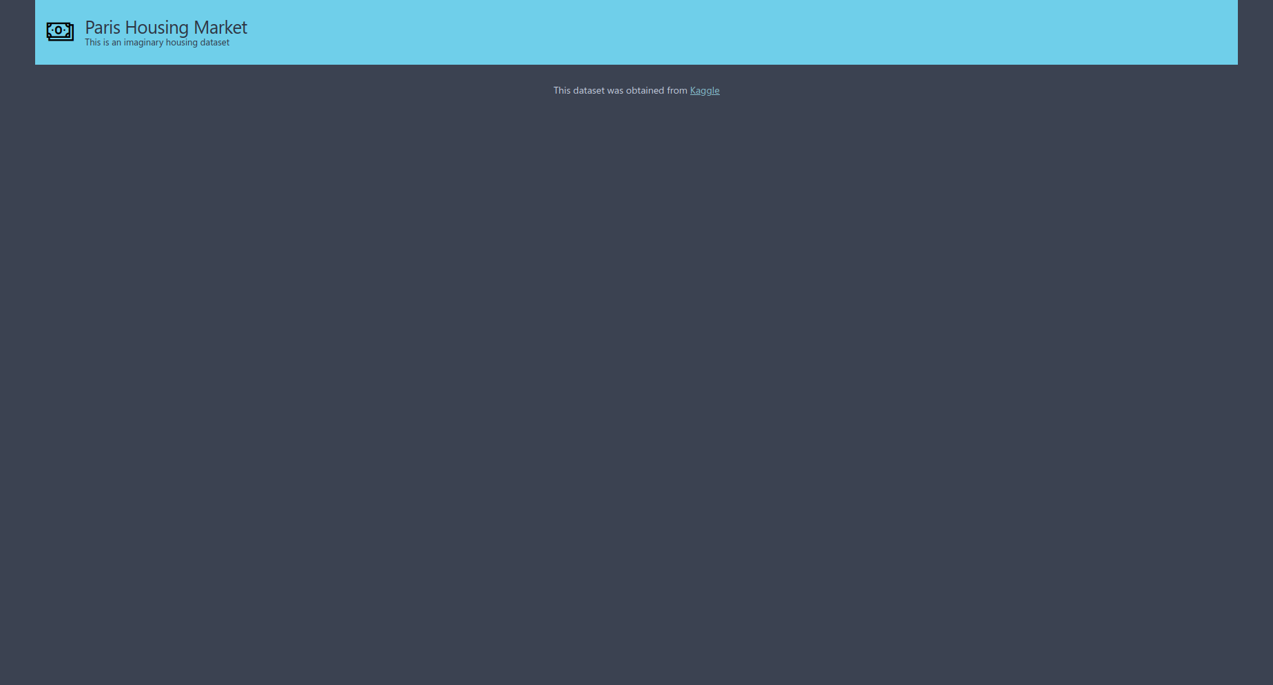
If you save app.py you should see the web app update in your browser to have a header and footer, like in the image below.
Adding a table
The first thing we’ll add to our app is a table to view the raw data. To start we’ll need to read in our data with pandas and then we can create a table with ui.table(), which we’ll put into a function called show_table(). Note that we will only load the first 100 rows of the table otherwise the app is slow to load.
import pandas as pd
df = pd.read_csv('ParisHousing.csv')

def make_table(df):
    return ui.table(name='table',
                    height = '250px',
                    columns = [ui.table_column(name=x, label=x) for x in df.columns.tolist()],
                    rows = [ui.table_row(
                    name = str(i),
                    cells = list(map(str, df.values.tolist()[i]))
                    ) for i in df.index[0:100]]
        )

def show_table(q:Q, df):
    # Add a title
    q.page['section1'] = ui.section_card(box='section1',
                                         title='Table of the data',
                                         subtitle=''
                                         )
    # Add the table
    q.page['table'] = ui.form_card(box=ui.box('top', width = '50%'),
                                   items = [make_table(df)]
                                   )
Sadly, there is no seemingly simple way to display a pandas.DataFrame with H2O Wave so we have to be a little cunning with how we feed our data frame into ui.table(). If you look at the documentation for ui.table() it expects arguments columns and rows with type List[TableColumn] and List[TableRow] respectively, so we cannot simply feed the columns and rows of our data frame to columns and rows. Instead, what we can do is use list comprehensions to define the columns and rows which is what we do in make_table() above. Defining the columns is pretty straight forward, we use ui.table_column() to define each column and pass in the column name from df.columns.tolist(). Defining the rows is a little more complicated. We can use the same trick as we did for the columns by using df.values.tolist() to extract the rows, however the arguments in ui.table_row() expect strings, so we need to convert the values passed to name and cells. For the list comprehension we can simply iterate over an array with the row indices and convert the name of each row to a string using str() which we pass to name. For the cells we need to map the output from df.values.tolist()[i] to a string and then set this as a list.
Now that we’ve made our table with make_table() we can make a function show_table() to display it in our app. We can use a section card to give a title above the table with ui.section_card() and add the table by passing it to the item argument inside a form card. We specify where the card will go by using the box argument. Here we are using ui.box() to specify which zone our table is in with 'top' and use the width argument to specify the desired space for the table. We need to then add these extra zones to apply_layout().
def apply_layout(q: Q):
    q.page['meta'] = ui.meta_card(box='', theme='nord', layouts=[
        ui.layout(
            breakpoint='xl',
            width='1600px',
            zones=[
                ui.zone('header'),
                    ui.zone('content', direction=ui.ZoneDirection.COLUMN,
                    zones=[
                        ui.zone('section1'), ##NEWLINE
                        ui.zone('top', size='310px', direction = ui.ZoneDirection.ROW), ##NEWLINE
                    ]),
                ui.zone('footer')
            ]),
    ])
Notice that we specify zones within zones here for the main body of our app. We specify 'content' and use the direction argument which is useful to define the layout direction for the app. We also use the direction argument in our top zone. This instructs our app to only fill up 50% of the top zone. We also use the size argument to specify the size of the zone, which for us is the height of the zone. Try changing this argument and you will see it’s effect. We’ll fill in the other 50% of the zone with some stats cards which we’ll walk through below.
Finally, to get the table to display in our app we need to call the function inside server().
async def sever(q: Q):

    apply_layout(q)
    show_homepage(q)
    show_table(q, df)

    await q.page.save()
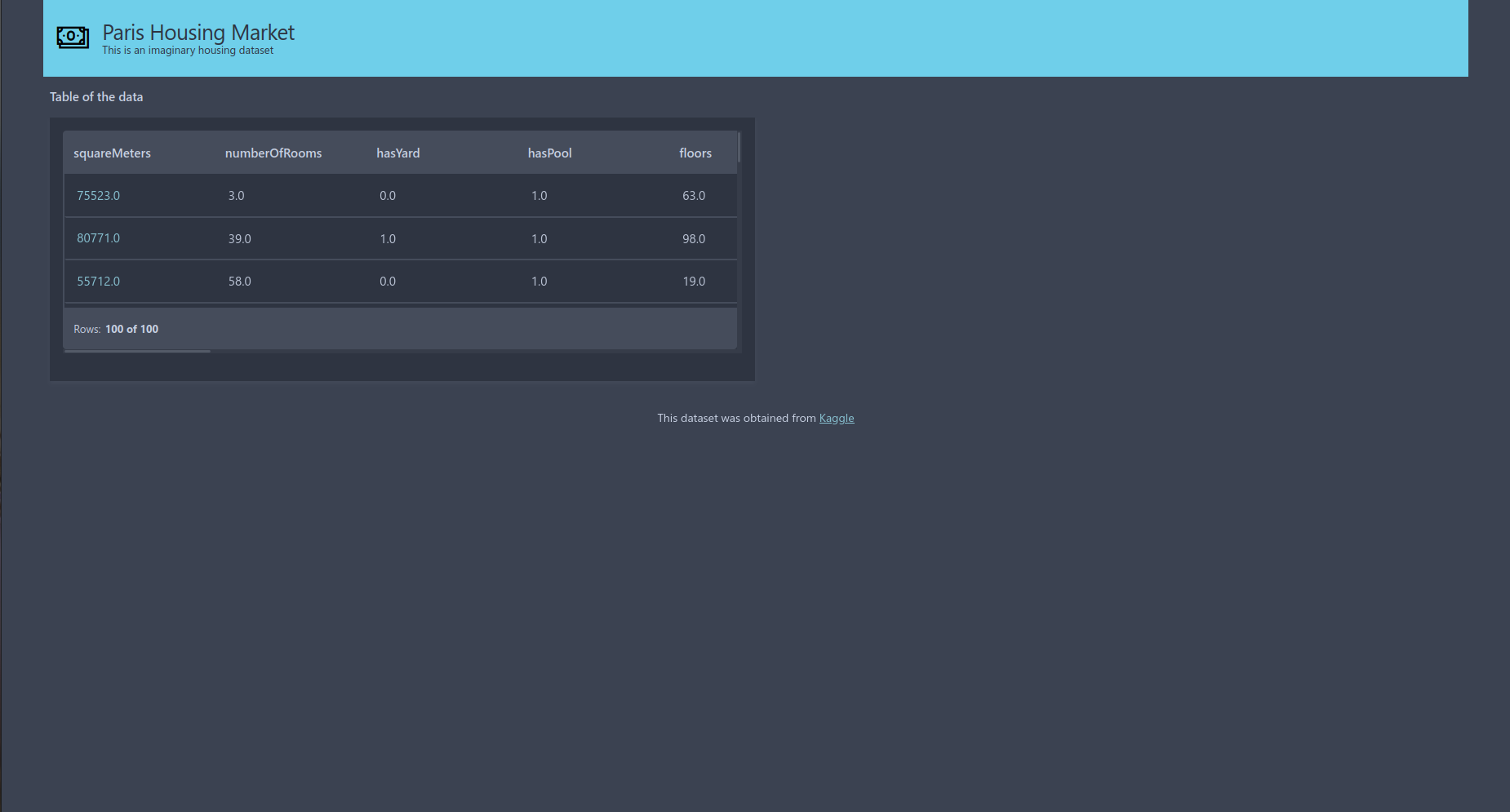
Now that we’ve updated server(), save the code and your browser should update and look very similar to this image.
Adding stats cards
Next we’ll add stats cards to our app to fill the space next to our table. Stats cards can be used in a variety of ways to display simple statistics. We are going to use them to display some binary data in our dataset, such as 'hasYard', by displaying the total number of attributes that are 1 (i.e. for hasYard the number of houses that have a yard).
def make_stats_card_data(q:Q, column):
    value_counts = column.value_counts()
    total = value_counts.sum()
    return value_counts[1], total

def show_stats_card(q:Q, column, index):
    value_count, total = make_stats_card_data(q, column)
    percentage = value_count/total

    q.page['stat'+str(index)] = ui.tall_gauge_stat_card(
        box = ui.box('top', width = '11.75%'),
        title = 'Number of houses with ' + column.name,
        value = '={{intl one}}',
        aux_value='={{intl perc style="percent" minimum_fraction_digits=2 maximum_fraction_digits=2 }}',
        progress = percentage,
        data = dict(one = int(value_count), perc = float(percentage)),
        plot_color = '$blue'
    )

def show_multiple_stats_cards(q:Q, df, index):
    for i in index:
        column_name = df.columns.tolist()[i]
        column = df[column_name]
        show_stats_card(q, column, i)
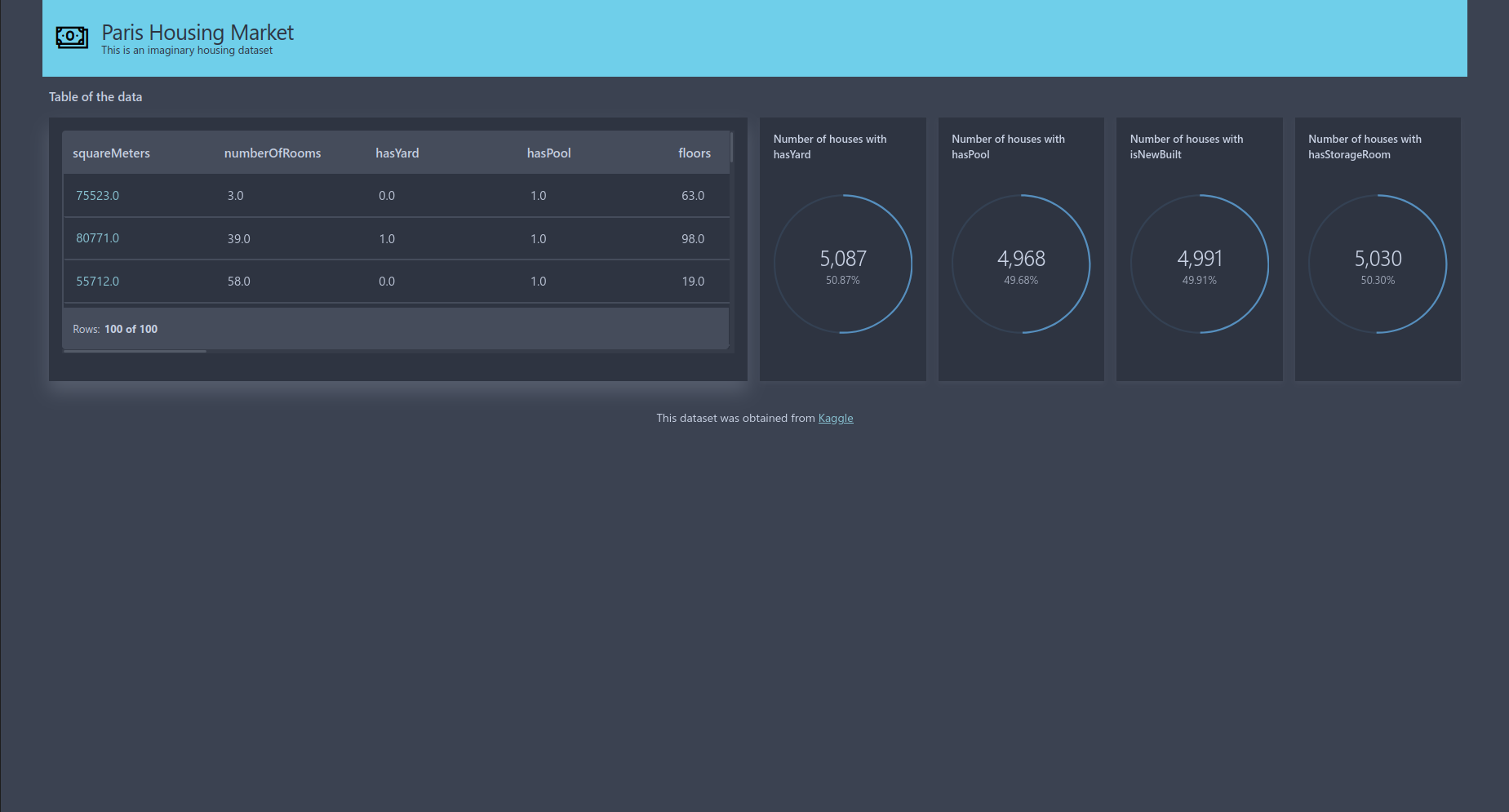
To start we need to transform the data that is passed to our stats card using make_stats_card_data() so it is in a suitable format. This counts the number of zeros and ones and sums the results to give the total. This is then used in show_stats_card(). Here we use a tall_gauge_stat_card() and using the same trick as before use ui.box() to define how much space our card takes up. Now to pass values to value and aux_value we need to pass information to our data augment. The simplest way to do this is by using a dictionary. We can then use the keys in our value and aux_value arguments. When looking at the documentation for a tall_gauge_stat_card we can see that the arguments just mentioned expect strings as their input. The standard way to pass arguments to these are by using ={{}} notation and then define the type of the data. We then give the keys from our dictionary and any other commands, such as the style to display the value and the number of decimal points to display (the values in the middle of the stats cards example image below). The progress argument is used in the circle around the data (the light blue colour in the example image below) and should be between zero and one. Finally, you can pass the colour of the circle using plot_color, but your argument must be of the form $<COLOUR>.
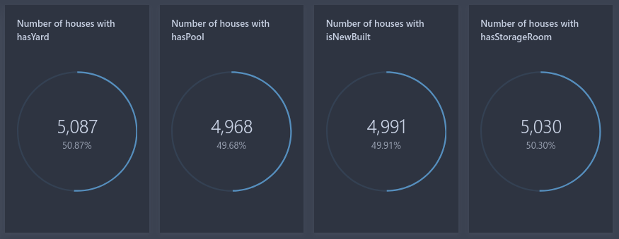
Notice in show_stats_card() how we set up our page. We give a base name, 'stats', and then add an addition string which can be changed to allow the same piece of code to produce multiple stats cards. This is what we do in show_multiple_stats_cards, we simply loop over different indices which related to the columns so we make multiple cards. If we didn’t do this and kept all cards labeled 'stats' only one stats card would appear in our app.
Like the table we created above, the final step is to add show_multiple_stats_cards() to server() and pass in columns that we want to display as stats cards. Here we have passed in indices of binary columns.
async def sever(q: Q):

    apply_layout(q)
    show_homepage(q)
    show_table(q, df)
    show_multiple_stats_cards(q, df, index = [2,3,9,14])

    await q.page.save()
After updating server() and saving your code you should see something very similar to this image.
Adding plots
The final items we will add to our app are some histogram plots. To add a histogram to our Wave app we first need to transform the data into bins and counts which we can then pass into a plot card, ui.plot_card().
We can transform our data pretty easily thanks to numpy. We simply need to pass our data to the numpy.histogram() function and reshape it so it is ready for the plot card. This is what we have done in our made_histogram_data() function in the code below.
def make_histogram_data(values):
    count, division = np.histogram(values)
    return [(x, y) for x, y in zip(division.tolist(), count.tolist())]

def show_histogram(q:Q, values, variable_name, index):
    q.page['feat'+variable_name] = ui.plot_card(
        box = ui.box('bottom', width = '25%'),
        title = 'Histogram of ' + variable_name,
        data = data(
                fields = ['division', 'count'],
                rows = make_histogram_data(values),
        ),
        plot = ui.plot([ui.mark(type='interval',
                                  x='=division', y='=count',
                                  y_min=0,
                                  x_title=variable_name, y_title='Count')]
            )
            )

def show_histograms(q:Q, df, index):
    q.page['section2'] = ui.section_card(box='section2',
                                        title='Plots of the data',
                                        subtitle='')

    column_names = df.columns.tolist()[index]
    for name in colum_names:
        values = df[name]
        show_histogram(q, values, name)
The next step is to make a histogram plot, which we will define inside show_histogram(). We can use ui.plot_card() to create a histogram. Using the same trick as we have previously, we use ui.box() to define the zone to display our histogram and the width of the card. We use the data argument to pass in the output from make_histogram_data() with the data() function. Inside data(), we use the fields argument to name the columns of our data, and make_histogram_data() to define the rows of the data, where each row is [division, count]. Finally, we use the plot argument to specify our plot using ui.plot(). When looking at the documentation for ui.plot() we can see it expects one argument, mark, which expects a list object with class Mark. To do this we use ui.mark(). Inside ui.mark() we define the plot type, what variable to use, along with various other options you have in a typical plotting function. For us to produce a histogram we must pass type='interval', and give division and count defined in data() to the x and y arguments. Note that we need to pass x='=X', instead of x=X or x='X'. To tidy the plot up we also pass ymin=0 to stop the histogram producing a negative y axis and also pass in some labels for the x and y axes with x_title and y_title.
To produce multiple histograms we use the same trick that we used when creating the stats cards by letting the page name vary in show_histogram(). This means when we create show_histograms() all we need to do is simply iterate show_histogram() over different column names with the relevant data and we will produce multiple histograms on our Wave app. We also add another section header into show_histograms() to give a heading to our histograms.
Next we need to update apply_layout() to define where the plot cards and section card will be placed. Similar to the 'top' zone, we again use the direction argument to specify the layout direction to be a row. i.e. we want to space the cards horizontally. We simply need to add two extra zones within our content zone labelled section2 and bottom.
def apply_layout(q: Q):
    q.page['meta'] = ui.meta_card(box='', theme='nord', layouts=[
        ui.layout(
            breakpoint='xl',
            width='1600px',
            zones=[
                ui.zone('header'),
                ui.zone('body', direction=ui.ZoneDirection.ROW, zones=[
                    ui.zone('content', direction=ui.ZoneDirection.COLUMN, zones=[
                        ui.zone('section1'),
                        ui.zone('top', size='300px', direction = ui.ZoneDirection.ROW),
                        ui.zone('section2'),
                        ui.zone('bottom', direction=ui.ZoneDirection.ROW),
                    ]),
                ]),
                ui.zone('footer')
            ]),
    ])
Then finally, we add show_histograms() to server() so the histograms will appear in the browser.
async def sever(q: Q):

    apply_layout(q)
    show_homepage(q)
    show_table(q, df)
    show_multiple_stats_cards(q, df, index = [2,3,9,14])
    show_histograms(q, df, index = [0, 1, 7, 8])

    await q.page.save()
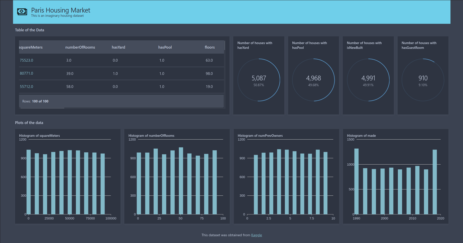
Now, you should see something very similar to the picture below in your browser.

The final code
Finally, here is the code in full that we have just produced above, hopefully your code should look very similar!
from h2o_wave import Q, ui, app, main, data
import numpy as np
import pandas as pd

df = pd.read_csv('ParisHousing.csv')
values = df.values.tolist()
variable_names = df.columns.tolist()

@app('/displayData')

async def sever(q: Q):

    apply_layout(q)
    show_homepage(q)
    show_table(q, df)
    show_multiple_stats_cards(q, df, index = [2,3,9,14])
    show_histograms(q, df, index = [0, 1, 7, 8])

    await q.page.save()

def show_homepage(q:Q):
    q.page['header'] = ui.header_card(
        box=ui.box('header', width='100%', height='86px'),
        icon='Money',
        icon_color='Black',
        title='Paris Housing Market',
        subtitle='This is an imaginary housing dataset')


    q.page['footer'] = ui.footer_card(
        box='footer',
        caption='This dataset was obtained from [Kaggle](https://www.kaggle.com/datasets/mssmartypants/paris-housing-price-prediction)')


def apply_layout(q: Q):
    q.page['meta'] = ui.meta_card(box='', theme='nord', layouts=[
        ui.layout(
            breakpoint='xl',
            width='1600px',
            zones=[
                ui.zone('header'),
                ui.zone('body', direction=ui.ZoneDirection.ROW, zones=[
                    ui.zone('content', direction=ui.ZoneDirection.COLUMN, zones=[
                        ui.zone('section1'),
                        ui.zone('top', size='300px', direction = ui.ZoneDirection.ROW),
                        ui.zone('section2'),
                        ui.zone('bottom', direction=ui.ZoneDirection.ROW),
                    ]),
                ]),
                ui.zone('footer')
            ]),
    ])

### Making table
def make_table(df):
    return ui.table(name='table',
                    height = '250px',
                    columns = [ui.table_column(name=x, label=x) for x in df.columns.tolist()],
                    rows = [ui.table_row(name = str(i), cells = list(map(str, df.values.tolist()[i]))) for i in df.index[0:100]]
                    )

def show_table(q:Q, df):
    q.page['section1'] = ui.section_card(box='section1',
                                         title='Table of the Data',
                                         subtitle='')
    q.page['table'] = ui.form_card(box=ui.box('top', width = '49.5%'),
                                    items = [make_table(df)],
                                    )
## Making stats cards
def make_stats_card_data(q:Q, column):
    value_counts = column.value_counts()
    total = value_counts.sum()
    return value_counts[1], total

def show_stats_card(q:Q, column, index):
    value_count, total = make_stats_card_data(q, column)
    percentage = value_count/total
    q.page['stat'+str(index)] = ui.tall_gauge_stat_card(
        box = ui.box('top', width = '11.75%'),
        title = 'Number of houses with ' + column.name,
        value = '={{intl one}}',
        aux_value='={{intl perc style="percent" minimum_fraction_digits=2 maximum_fraction_digits=2 }}',
        progress = percentage,
        data = dict(one=int(value_count),perc=float(percentage)),
        plot_color = '$blue'
    )

def show_multiple_stats_cards(q:Q, df, index):
    for i in index:
        column_name = df.columns.tolist()[i]
        column = df[column_name]
        show_stats_card(q, column, i)

### Making histograms
def make_histogram_data(values):
    count, division = np.histogram(values)
    return [(x, y) for x, y in zip(division.tolist(), count.tolist())]

def show_histogram(q:Q, values, variable_name, index):
    q.page['feat'+str(index)] = ui.plot_card(
        box = ui.box('bottom', width = '25%'),
        title = 'Histogram of ' + variable_name,
            data=data(
                fields=['division', 'counts'],
                rows=make_histogram_data(values),
                pack=True,
            ),
            plot=ui.plot([ui.mark(type='interval',
                                  x='=division', y='=counts',
                                  y_min=0,
                                  x_title=variable_name, y_title='Count')]
            )
            )

def show_histograms(q:Q, df, index):
    q.page['section2'] = ui.section_card(box='section2',
                                        title='Plot of the data',
                                        subtitle='')
    for i in index:
        column_name = df.columns.tolist()[i]
        values = df[column_name]
        show_histogram(q, values, column_name, i)
Next steps
Now that we’ve made our app why not go ahead and try to add other widgets to it or maybe change the layout or colour scheme? Take a look at the Wave documentation to see what else you could add! There are examples on how to use most widgets and step-by-step guides talking through various topics such as page layouts, uploading files and writing tests.
H2O Wave also have a GitHub repository with applications that they have made which you could try using and editing for your own use. If that isn’t enough links for you to look at, the Wave website also has a blog section where they announce any updates and share other useful information.
Finally, I always find it helpful to look through a few different examples of how to code something when I’m learning a new skill so why not take a look at this video tutorial made by H2O. The tutorial will show you how to create a simple app for displaying data a bit like what we have just gone through (but they make the app more interactive). Note that the tutorial was created in 2021 so it uses an older version of H2O Wave. It still works with the latest version of H2O Wave (which at the time of writing is 0.20), the only difference is how to run the app. In previous versions (below 0.20) we needed to start a wave server manually, but now we can simply run your wave app by wave run <code_script> and the wave server is started automatically.
Jumping Rivers are now an H2O.ai partner, so if you want any further information please feel free to contact us. You can also check out our courses on H2O Wave and H2O Driverless AI.
I hope you found this tutorial helpful. Have fun making your next H2O Wave app!

