Ghost in the Shell Script
Published: May 28, 2026.
Some thoughts on learning to use Claude to write Bash shell scripts and improve my productivity.
Tim has a PhD in physics from the University of York. He is a web developer with a passion for bringing data science and visualisation to the browser using JavaScript libraries and frameworks like d3 and Vue.
Published: May 28, 2026.
Some thoughts on learning to use Claude to write Bash shell scripts and improve my productivity.
Published: March 12, 2026.
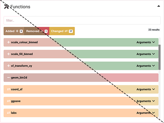
Introducing the Frontend Dashboard Health Check!
Published: November 20, 2025.
A brief introduction to Figma Design and some its most useful features, aimed at creators of data dashboards.
Published: June 5, 2025.
Adding images to a web page used to be easy. Now with high-resolution screens and an array of modern image formats it can feel like much more work. This post explains why things have become more complex and suggestions solutions for making life a little easier and web pages more performant.
Published: April 15, 2025.
At Jumping Rivers we love data dashboards and are delighted to announce the release of a gallery to showcase our application-development skills.
Published: April 8, 2025.
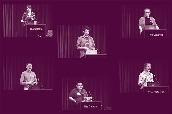
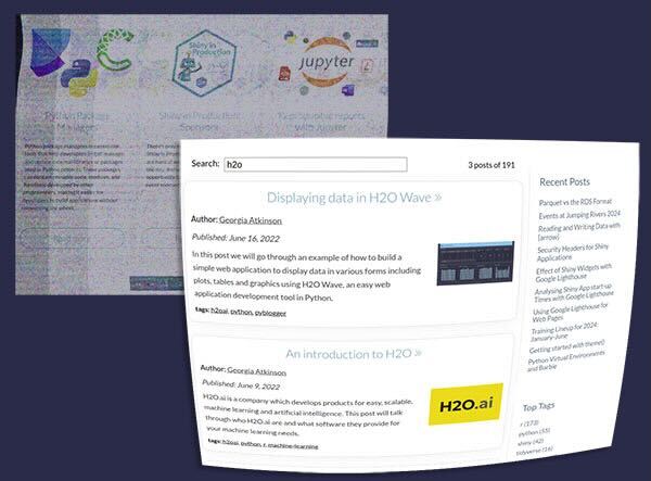
All our videos from Shiny in Production 2024, collected together in one place.
Published: January 30, 2025.
This post, Part 2 in a series of two, looks at styling and deploying the Observable Framework app we built in part 1.

Published: January 23, 2025.
The fourth instalment of Shiny in Production is back this October, hosted at the Catalyst in Newcastle upon Tyne, with super early bird tickets deadline for Shiny in Production ends on the 31st of January.
Published: January 16, 2025.
This post, Part 1 in a series of two, looks at porting the functional code of a Shiny app - written in R - into JavaScript code to be used in an Observable Framework application.
Published: June 27, 2024.
R has come a long way since it's initial public release in August 1993. Explore some highlights of the last thirty years in an interactive timeline.
Published: February 15, 2024.
A very quick introduction to the new-look blog and tags pages and the brand new author pages.
Published: June 8, 2023.
Browsers have been implementing variations on a JavaScript fullscreen API for over a decade. Unfortunately, for much of that time the APIs varied across browsers. This made actually using it in production somewhat cumbersome. In this blog, we show you how to put parts of your Shiny application into fullscreen with only a few lines of JavaScript.
Published: March 30, 2023.
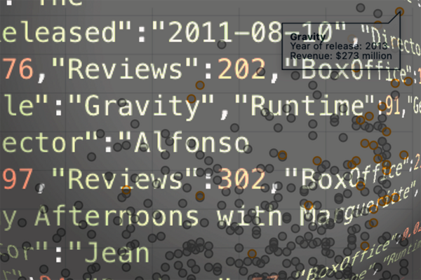
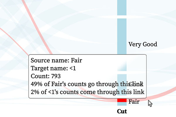
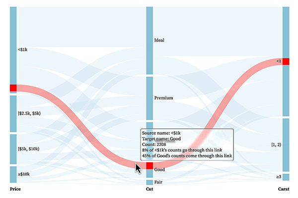
Tooltips in interactive graphics provide a means of giving the user precise details about particular features of the underlying dataset. Using some simple CSS, this post explores how tweaking the design of tooltips can improve the user's experience.
Published: January 26, 2023.
This post covers the "why?" and "how?" of making Shiny applications feel like they respond instantaneously to users' interactions.
Published: August 4, 2022.
This article looks at how we added new themes to diffify.com to make the site more accessible to users with visual impairments and the tools we used to check the suitability of our new themes.
Published: July 28, 2022.
In this post we'll look at low contrast sensitivity and colour vision deficiencies and why we wanted to make changes to diffify.com to make it more accessible to users with these conditions.